
Why Is There No Provision Made For Colourblind People?
[See the picture on the left? I can see nothing in it except dots!]
Seven percent of males are colour blind. One percent of males have deuteranopia, one form of colourblindness which affects the ability to distinguish between certain colour groups. I ‘suffer’ from it, and I have great trouble seeing the difference between orange/red/yellow/green/brown, between blue/violet, and very light colours, like light pink and light grey. I also cannot see small amounts of colour, like the full stop at the end of this sentence. I’ll assume it’s black, but I’ll have to take your word for it.
This is not a severe disability in any way. It’s not even a disability in the legal sense of the word. I don’t recall being given a free computer and two hundred quid a week, so it can’t be. My life, I suppose, functions as normal. But because I’m colourblind, I am excluded from being many things: a pilot, an electrician, a doctor/vet/nurse or anything in the medical profession, a painter and decorator. Any creative- or arts-related vocation would be difficult for me to do, especially something like professional design. I doubt the Armed Forces would be too chuffed at me shooting the green beret instead of the red one. However none of these things affect my daily routine – many people are excluded from certain professions for many differing reasons. However, there are some things that do affect how I get through my day as a colourblind person, and, frankly, I feel I, and the rest of the seven percent, could do with some help here.
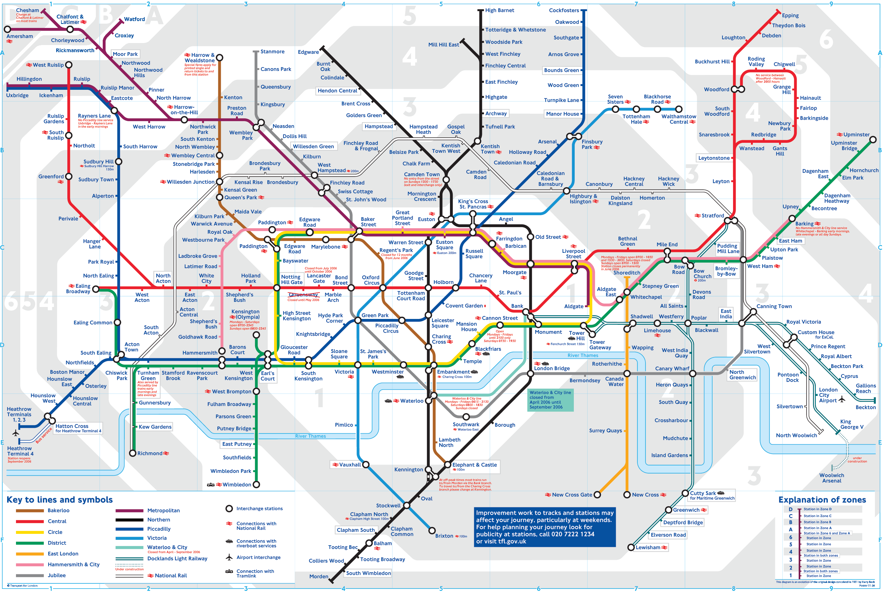
One thing I always have trouble with when visiting London is the Tube Map. Long, very thin/small lines of very similar colours. Greens and browns, yellows and oranges, blues and purples. Imagine someone gave you the following instructions for getting across London on the tube…
”Choose the green line, or the brown line, until you reach either the blue line or the purple line, then, take either the pink or grey line until you reach the red or green line, and you’re there!"
You know where I’m going with this right? Unfortunately, anyone who is colourblind has great difficulty knowing where they are going if trying to follow the London Underground map. It needs an additional system, or an alternative map for the many millions of colourblind people who use it. A system that doesn’t rely solely on colour for its clarity.
Here’s another scenario. A real one too.
“When the [very small] orange light has turned green, your cordless drill is fully charged”. Why couldn’t they have two separate lights? Why did they have to rely solely on colour when a percentage (around 7% of males) won’t be able to decipher it? Why, and this is a huge bugbear of mine, couldn’t they have additional text, under a second light that says ‘when this light is on your drill is fully charged’. (“Fully Charged” would no doubt suffice, or some other EASILY DECIPHERED abbreviation). I just leave my drill on overnight. I have no other choice. And why do manufacturers rely on lights anyway? Or just as bad, symbols? How many different symbols are there on electrical items? Go and look at you hair dryer, DVD player, or toaster. I guarantee they all have different symbols for similar things. Why can’t they just say on and off, in text? Why use a symbol? Why do different manufacturers use different symbols for the same thing? Worst of all, why do some manufacturers rely solely on colour to denote something is on/off/done/ready/overheating/malfunctioning when seven percent of males can’t see it? Is it because a small percentage of customers can’t read text? It’s a shame they didn’t offer colourblind people the same consideration. One percent of people can’t read or write, 3.5 percent of people (i.e. seven percent of males) can’t see colours properly. Someone in marketing is not analysing these statistics correctly!
What befuddles me the most is how the whole situation has gone on so long without anyone complaining about it. In an age where every hindrance, ‘challenge’, or disability has a long-winded name (you’re not crap at spelling, you’re dyslexic), a charity, and government department dedicated to easing the lives of its sufferers, colourblindess, it would seem, is attracting the attention of precisely and absolutely no-one.
I’m not going to compare the statistics of real disabilities, nor will I compare ways in which one disability is worse than another, that would possibly be hurtful to some, and in very bad taste, but what I can’t understand is why government bodies, when deciding and deliberating the design of an item that is going to be used every day by millions of people, like a tube map, chose to ignore the reading abilities of 7% of one half of the population?
Perhaps because no one who works in professional design is ever colourblind?
Whatever the reason, colourblindness is real, is a REAL hindrance, and it’s time something was done about it.
[See the picture on the left? I can see nothing in it except dots!]
Seven percent of males are colour blind. One percent of males have deuteranopia, one form of colourblindness which affects the ability to distinguish between certain colour groups. I ‘suffer’ from it, and I have great trouble seeing the difference between orange/red/yellow/green/brown, between blue/violet, and very light colours, like light pink and light grey. I also cannot see small amounts of colour, like the full stop at the end of this sentence. I’ll assume it’s black, but I’ll have to take your word for it.
This is not a severe disability in any way. It’s not even a disability in the legal sense of the word. I don’t recall being given a free computer and two hundred quid a week, so it can’t be. My life, I suppose, functions as normal. But because I’m colourblind, I am excluded from being many things: a pilot, an electrician, a doctor/vet/nurse or anything in the medical profession, a painter and decorator. Any creative- or arts-related vocation would be difficult for me to do, especially something like professional design. I doubt the Armed Forces would be too chuffed at me shooting the green beret instead of the red one. However none of these things affect my daily routine – many people are excluded from certain professions for many differing reasons. However, there are some things that do affect how I get through my day as a colourblind person, and, frankly, I feel I, and the rest of the seven percent, could do with some help here.
One thing I always have trouble with when visiting London is the Tube Map. Long, very thin/small lines of very similar colours. Greens and browns, yellows and oranges, blues and purples. Imagine someone gave you the following instructions for getting across London on the tube…
”Choose the green line, or the brown line, until you reach either the blue line or the purple line, then, take either the pink or grey line until you reach the red or green line, and you’re there!"
You know where I’m going with this right? Unfortunately, anyone who is colourblind has great difficulty knowing where they are going if trying to follow the London Underground map. It needs an additional system, or an alternative map for the many millions of colourblind people who use it. A system that doesn’t rely solely on colour for its clarity.
Here’s another scenario. A real one too.
“When the [very small] orange light has turned green, your cordless drill is fully charged”. Why couldn’t they have two separate lights? Why did they have to rely solely on colour when a percentage (around 7% of males) won’t be able to decipher it? Why, and this is a huge bugbear of mine, couldn’t they have additional text, under a second light that says ‘when this light is on your drill is fully charged’. (“Fully Charged” would no doubt suffice, or some other EASILY DECIPHERED abbreviation). I just leave my drill on overnight. I have no other choice. And why do manufacturers rely on lights anyway? Or just as bad, symbols? How many different symbols are there on electrical items? Go and look at you hair dryer, DVD player, or toaster. I guarantee they all have different symbols for similar things. Why can’t they just say on and off, in text? Why use a symbol? Why do different manufacturers use different symbols for the same thing? Worst of all, why do some manufacturers rely solely on colour to denote something is on/off/done/ready/overheating/malfunctioning when seven percent of males can’t see it? Is it because a small percentage of customers can’t read text? It’s a shame they didn’t offer colourblind people the same consideration. One percent of people can’t read or write, 3.5 percent of people (i.e. seven percent of males) can’t see colours properly. Someone in marketing is not analysing these statistics correctly!
What befuddles me the most is how the whole situation has gone on so long without anyone complaining about it. In an age where every hindrance, ‘challenge’, or disability has a long-winded name (you’re not crap at spelling, you’re dyslexic), a charity, and government department dedicated to easing the lives of its sufferers, colourblindess, it would seem, is attracting the attention of precisely and absolutely no-one.
I’m not going to compare the statistics of real disabilities, nor will I compare ways in which one disability is worse than another, that would possibly be hurtful to some, and in very bad taste, but what I can’t understand is why government bodies, when deciding and deliberating the design of an item that is going to be used every day by millions of people, like a tube map, chose to ignore the reading abilities of 7% of one half of the population?
Perhaps because no one who works in professional design is ever colourblind?
Whatever the reason, colourblindness is real, is a REAL hindrance, and it’s time something was done about it.
Hey, I'm a graphic design student and I'm writing my dissertation about the impact a designer's colour choice can have on a colour blind person. I'm writing something about the tube map as well and that's how I found your blog :) Your posts are really inspiring and I would really like to use your tube map in my dissertation if you don't mind. It's just great, too bad tfl doesn't put something like that on their website.
ReplyDelete